contact us

Use the form on the right to contact us.

You can edit the text in this area, and change where the contact form on the right submits to, by entering edit mode using the modes on the bottom right.

7614 Montgomery Avenue
Elkins Park, PA, 19027
United States

2157962955

Kelsh Wilson Design creates message-driven marketing communications, in print and on the web, for education, business, and nonprofits. Admissions / Advancement / Branding / Photography + Video

kelsh-wilson-design-print-pixels.gif

Blog

Print & Pixels: Kelsh Wilson Design's blog where we post our latest news and inspiration. Kelsh Wilson Design creates message-driven marketing communications, in print and on the web, for education, business, and nonprofits. Admissions / Advancement / Branding / Photography + Video


Make the Most of Your School Magazine

melinda wissmann

kelsh-wilson-design-magazines-matter.gif

In this age of fleeting tweets—in fact, more than at any recent time— alumni, parents, and donors love getting your magazine. They’ve told us exactly that. So it’s worth the effort to make the most of this unique publication. In projects for four different partner schools, Kelsh Wilson shows how.

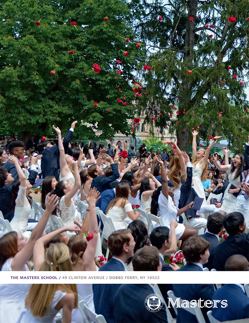
The Masters School in Dobbs Ferry, NY, the Canterbury School in New Milford, CT, The Independence School in Newark, DE, and Penn Engineering, part of the University of Pennsylvania, are four very different institutions, each publishing different school magazines. But all have partnered with Kelsh Wilson in order to take the opportunity—at several key points each year— to put their best foot forward.

Kelsh Wilson has worked with each school to develop new design approaches for their magazines and to produce issues of their periodicals that reflect this design consistently over time. In certain instances, we’ve also helped with photography and with writing of high-profile feature stories.

The look and feel of Penn Engineering, The Masters School’s Bulletin, Indy’s Spirit, and Pallium (the Canterbury’s School’s periodical) differ in ways that reflect the school’s individual identities. All, however, reflect several key approaches.

1) Sophistication in Design

We’ve all seen periodicals from educational institutions that actually feel more like newsletters—from clunky typography to a suffocating absence of white space. Readers often tell schools they love these magazines, because they do love the news they contain. In reality though, publications like these damage the image of the schools they represent.

The design of your magazine is a chance to project the quality and professionalism of your institution through the quality and professionalism of your design choices. This is about more than pure aesthetics. In a world where every reader sees hundreds of examples of smart design every day, it’s about putting your school in the right company. It’s positioning yourself as the kind of organization that inspires pride, loyalty, respect, and support.

 2) Practicality in Imagery

From the photos that make National Geographic the wonder it is to the signature cover illustrations of The New Yorker, it’s no secret that an enormous part of a magazine’s impact comes from its visual content. It’s also no secret that most schools don’t have the kind of budgets these national titles do to commission photographers and illustrators.  

The answer is to work practically with the images that are possible given your budget. When you do spend money, focus it on the most important visuals in your publication: the cover photo and the images to support your feature stories. Conversely, when you have to make do with less-than-inspiring existing shots, run them small. When you have the chance, shape your story list around the visuals (i.e., don’t make the cover story about your gala if you know it’s going to mean a dozen paralyzing grin-and-grabs).

When you do have the chance to hire a photographer, make the most of your investment. Schedule efficiently—as Penn Engineering always does in working with Kelsh Wilson’s photographers. And, grab everything you can—not just the big planned shots but student faces, architectural details, and found moments—little gems you know you’ll use to brighten up otherwise dull pages.

3) Strategy in Content

Too many magazine staffs exercise too little imagination when it comes to developing their story lists. Yes, there will always be events to cover and sports to recap. There will always be a place for a snowy campus scene. The questions, however, that too often go unasked are: What is the content we need to feature to build our brand? And How can we show our stakeholders our mission in action?

These are the kind of questions that lead your team to develop meaningful, original content—pieces that generate real reader feedback.

Customize Your Collaborations

If the challenge of making your magazine into the publication you want it to be seems daunting, think of all the ways you can get help. Yes, you can hire a creative agency to take over the project, or you just can get some focused strategic advice on content planning.

Yes, you can partner with a design professional to layout every issue, or just to do a one-time facelift and create a set of templates that your in-house team can use going forward. 

Yes, you can find a top-notch photographer to fill every issue with beauty, or you can get that same great photographer to give you one day of his best work twice a year and really make the most if it.

Be smart. Be practical. Be the magazine people admire!

Putting Messaging Strategies Into Action / GMU's Volgenau School of Engineering

melinda wissmann

Volgenau-GMU-kelshwilson.jpg

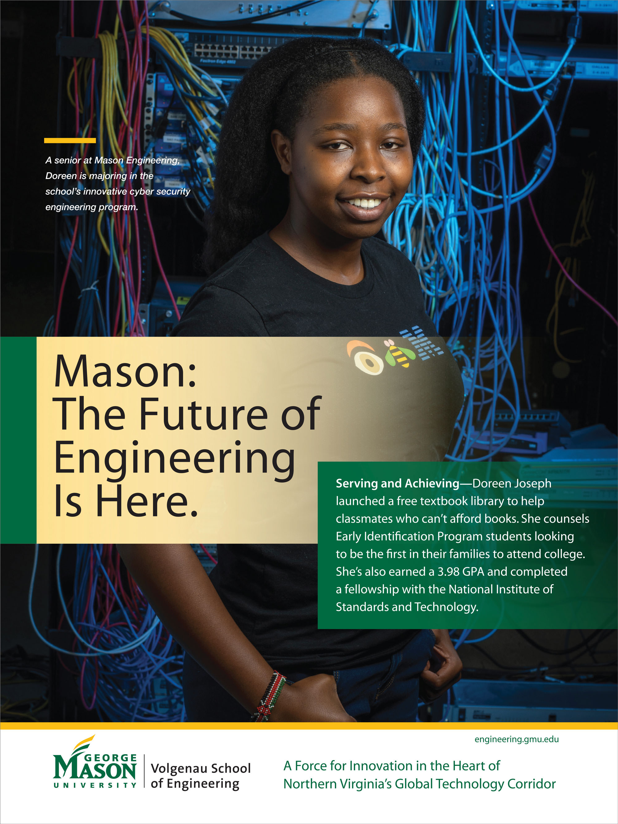
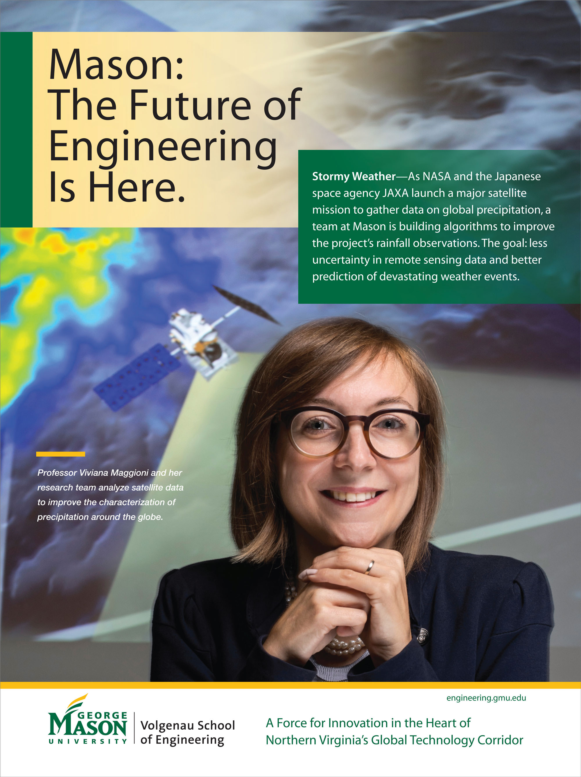
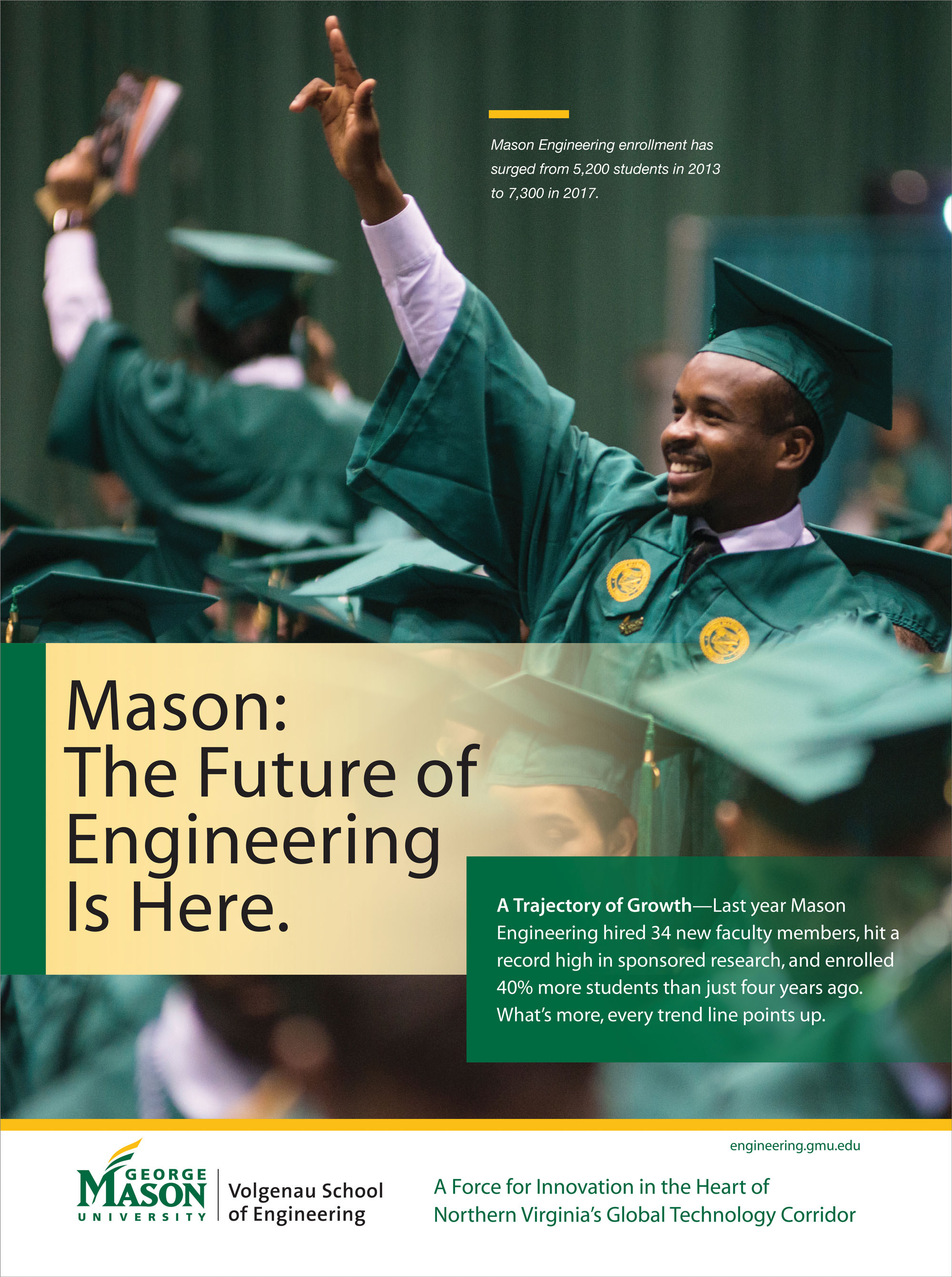
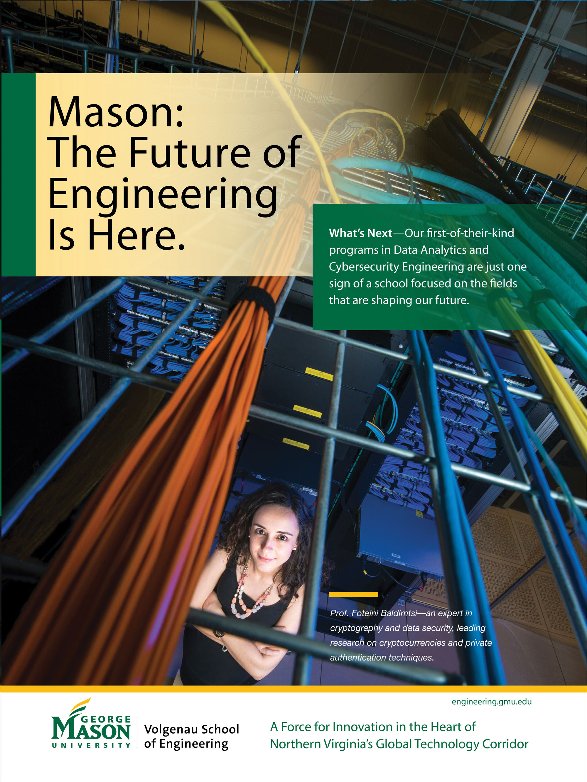
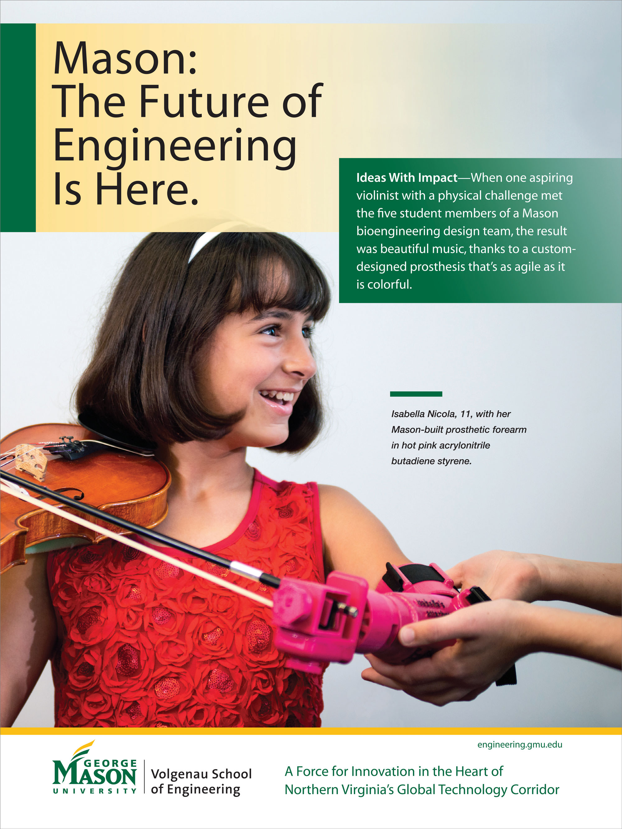
Working with the Volgenau School of Engineering at George Mason University, Kelsh Wilson built a program of brand tools, then put those tools to work through a campaign of carefully targeted ads. The goal: to reach a group of particularly important influencers, including deans of peer schools nationwide. 

It’s a twist on an old joke: How does an institution create the public image it wants? Answer: Very carefully.

In this case, the institution is the Volgenau School of Engineering at George Mason University, an organization that’s dynamic, fast growing, thrillingly diverse—and not as well known as it deserves to be. In early 2017, Kelsh Wilson undertook a project to change that fact, a reinvention of the Volgenau message that resulted in a new brand, intentionally planned to spotlight the school’s truly distinctive strengths and to reach a range of audiences.

The program was built around the tagline “The Future of Engineering is Here”—a phrase uniquely appropriate to this decidedly forward-looking school.

Shortly after the launch of the new brand, KWD teamed up with Volgenau to bring the school’s new messages to life while reaching out to a particularly important audience. This was the membership of the ASEE—the American Society of Engineering Education—including deans and department heads at engineering schools across the nation. The members of this relatively small group have a big impact when it comes to shaping opinion—and voting on rankings—in their field.

Working with the Volgenau communications team, Kelsh Wilson set out to impress these key influencers with a series of ads in the ASEE magazine, Prism. Each of these ads tells a single story, and each of these stories makes the same point: that the future of engineering really is taking shape at Volgenau.

One submission highlighted NASA-funded work on machine algorithms used to process flight data in new ways, leading to safer skies. Another explored Air Force-funded cybersecurity research targeting malicious software in the form of so-called “Trojans.”

Whatever the topic, Kelsh Wilson works to distill complex stories into compact (but accurate) form and to pair the text with images that leap off the page.


Powerful Annual Giving Appeals / Nichols School

melinda wissmann

Kelsh-Wilson-Design-Nichols-School-Annual Fund.jpg

The challenge of creating effective annual giving solicitations year-in and year-out is telling essentially the same story again and again, but always differently and always well.

At Kelsh Wilson, we believe the answer lies in diving deeply into the life and work of the school. When we seek out stories of teaching and learning, of innovation, and of student achievement, we find evidence that speaks straight to the hearts and minds of donors.

As Kelsh Wilson helped the Nichols School in Buffalo, NY, to develop its most recent series of annual fund communications, our source of inspiration was the school’s strategic plan. We asked where Nichols had made exciting strides toward its published goals, and we found stories of growth and progress—and of educators enriching the lives of students.

One of the year’s appeals focused in on Nichols’ Entrepreneurial Studies program, another on its exemplary service-learning offerings, a third on leadership development experiences. All included quotes, photos, and interesting stories—in brief.

In each case, we presented content specific enough to be interesting, but with a broader point: Nichols is engaged in exciting, important work. The impact on students is clear, the partnership of donors, essential.

In the world of annual giving, there may be nothing new under the sun. But by writing skillfully about the right themes, great schools can tap a limitless supply of donor-motivating content. And those right themes all trace back to the same origin. It’s force that connects stakeholders to an institution in the first place: its mission.

Gift Reports Designed to Inspire Giving / The Masters School

melinda wissmann

The Masters School Annual Report

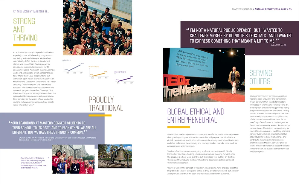
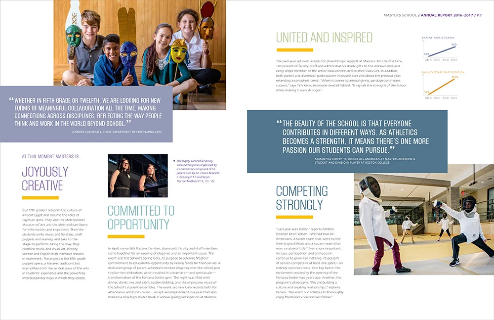
Working with The Masters School in Dobbs Ferry, NY, Kelsh Wilson created an annual report that not only recognizes donors but also presents a picture of the school designed to make the impact of their philanthropic support crystal clear.

Annual gift reports provide the perfect proof that when it comes to compelling communications, context is everything. You see, whether in printed or digital form, gift reports fulfill a simple core function: recognizing the year’s donors by name. However, if your gift list comes wrapped in stories that show vividly the impact of the gifts donors have made, the piece becomes something more. It becomes a vehicle to position your organization, to build stakeholder pride, and—indirectly but powerfully—to make the case for next year’s commitment.

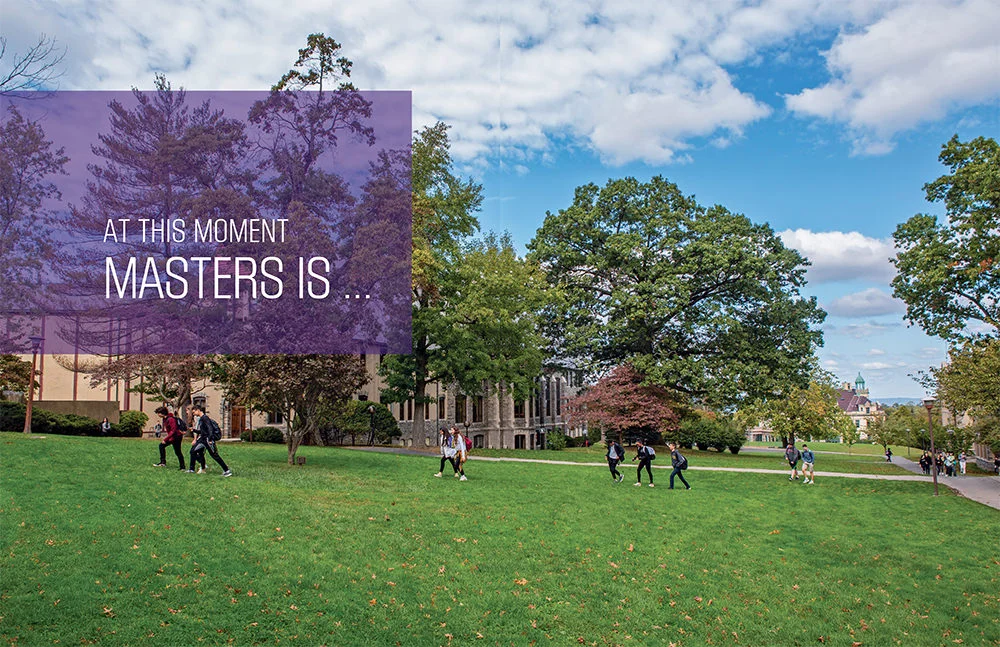
The 2016-17 annual report/gift report that Kelsh Wilson developed for The Masters School, a top independent boarding and day school outside New York City, works to accomplish all these goals. Its theme is “Masters at this Moment.” Over a five-page narrative section, in a series of brief vignettes, the piece informs readers that Masters is…. “Strong and Thriving,” “Committed to Opportunity,” “Competing Strongly,” “Looking to the Future with Bold Ambition,” and more.

The stories provide ample fuel for pride. (Admissions metrics make clear Masters is a school of choice, increasingly selective. Stories on arts, academics, athletics, and service programs all show strength and growth as well.)

Perhaps most important, these stories connect the school’s success to donor support. A piece on the theme of “opportunity,” celebrates the impact of financial aid—and of a gala fundraiser supporting it. A piece themed “United and Inspired” focuses on the many ways members of the community contribute to its vitality, including record levels of annual giving participation.

Of course, it helps to impress donors (and everyone else) when you have the kind of impressive evidence that Masters can muster. However, in planning your annual report, the goals are the same whether you’ve had a record-breaking year or not: first, to put your best foot forward, spotlighting your institution at its proudest; second to make clear the part your donors have played in writing your story of success.

The Masters School Annual Report
Kelsh-Wilson-Masters-Photo8.jpg
Kelsh-Wilson-Masters-Photo1.jpg
Kelsh-Wilson-Masters-Photo2.jpg
Kelsh-Wilson-Masters-Photo5.jpg
Kelsh-Wilson-Masters-Photo3.jpg
Kelsh-Wilson-Masters-Photo4.jpg

The Strategy of Synergy / Whittier College

melinda wissmann

kelsh-wilson-whittier-email-V2-2.jpg

Working with Whittier College in Southern California, Kelsh Wilson showed the power of leveraging your investment in admissions communications to create projects of other kinds that draw on the same look and drive home the same themes.

In the world of marketing, it can sometimes be tough for small schools to compete with larger ones, especially when the bigger institutions have proportionally larger budgets. Small schools do have at least one advantage, however: It is far easier for them to coordinate their many forms of outreach to project a single, consistent image.

Having worked with liberal arts colleges and independent schools on the one hand and flagship research universities on the other, this is a lesson the Kelsh Wilson team has learned firsthand. It is also an insight we recently put to work in a developing a series of projects for Whittier College in California, an excellent liberal arts school with just over 1,600 students.

The College’s first priority was to create a series of new admission publications— very brief, solidly on message, and in-synch with Whittier’s newly redesigned website. However, Whittier’s wish list included other items as well, from a re-design of the College magazine, The Rock, to banners to brighten campus walkways. They also requested creation of a series of templates to be used for print and email communications produced by units across campus, from the president’s office to the registrar, to alumni and development.

Kelsh Wilson’s approach started by focusing on design and messaging for the re-invented admissions materials, brief, bold, and light in tone, but driving home compelling content points, whether about the distinctive strengths of liberal arts learning or the career success of recent grads.

KWD’s designers then took key elements from the admission pieces—from typefaces and dominant colors to aspects of layout—and applied them in developing flexible templates for a multitude of other print and digital uses, from emails and invitations to short brochures. They also applied these elements in the design of banners that will define the boundaries of campus and festoon the paths followed by families on admissions tours.

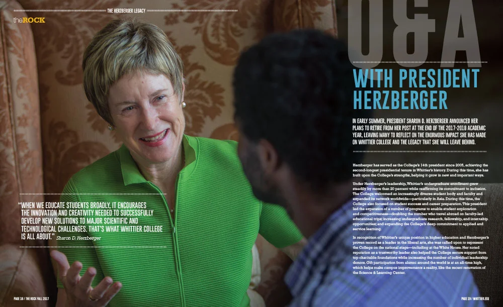
In redesigning The Rock, Whittier’s magazine, the team extended the look further and took greater liberties, creating a solution suited to the unique content demands of a periodical. Still, it’s easy to recognize the magazine as an expression of the same institution behind the rest of the communications program.

The synergistic approach Whittier and Kelsh Wilson followed offers two important advantages. First, for any institution whose success depends primarily on tuition revenue, it’s smart to use every investment in marketing and communication to reinforce the impression created by the school’s admission outreach. Second, by making the admission materials the pragmatic starting point for other important projects, the client can realize major savings—working with one firm rather than several and investing in a single major design exploration (albeit with variations), rather than many.

Kelsh-Wilson_Whittier-Covers.jpg
Kelsh-Wilson-Whittier-Travel-cover.jpg
Kelsh-Wilson-Whittier-Travel-1.jpg
Kelsh-Wilson-Whittier-Travel-2.jpg
Kelsh-Wilson-Whittier-Travel-back.jpg
Kelsh-Wilson-Whittier-Transfer-1.jpg
Kelsh-Wilson-Whittier_Outcomes_1.jpg
Kelsh-Wilson-Whittier-Outcomes-2.jpg
Kelsh-Wilson-Whittier-Visit-1.jpg
Kelsh-Wilson-Whittier-The-Rock-cover.jpg
Kelsh-Wilson-Whittier-The-Rock-1.jpg
Kelsh-Wilson-Whittier-The-Rock-3.jpg
Kelsh-Wilson-Whittier-The-Rock-4.jpg
Kelsh-Wilson-Whittier-The-Rock-5.jpg

Campus Displays with Marketing Impact / The Independence School

melinda wissmann

Indy_banner email V3-1.jpg

Kelsh Wilson teamed up with The Independence School in Newark, Delaware, to create a series of exterior displays that bring key elements of the school’s brand—very visibly—to life.

Until recently, The Independence School faced a challenge common to many institutions: When you looked at its main building from the outside, it was impossible to have any sense of the energy within.

Outside, you saw unrevealing, if impressive, facades of brick. Inside, you saw all vitality and creativity of an exceptional place of learning—one populated by 500 children, age 3 through grade 8.

The situation represented something of a marketing challenge. After all, visitors’ first impressions were inevitably of a place more institutional than personal. It also represented a lost opportunity. Guests and passersby who saw the Independence building might easily go away knowing nothing more about the school than when they came.

Kelsh Wilson’s answer to the challenge was big, bold, and multifaceted:

  • welcoming banners on the lampposts along the campus entry drive with photos of Independence children and others around the central campus quad with bold message lines,

  • larger banners hanging from the building itself, featuring the words “Inspire,” “Dream,” and “Achieve” from the school’s motto,

  • special signs trumpeting the school’s 40th anniversary, and

  • artful shapes—stars and expressive lines—festooning a long expanse of empty windows along a key connecting corridor.

Together, these displays help create a stronger sense of place, in effect branding the Independence campus. They bring life and color to exterior spaces in a whole new way. And, they build clearly on graphic elements and messaging used in the school’s print and digital communications, creating the chance for extra resonance. (The branding program including these graphic elements and messages was one of several previous projects that Kelsh Wilson developed for Independence.)

One lovely touch in the creative execution of the program involves the different effects inside and outside the building created by the stars-and-lines window decorations. Outside, they project color and suggest a sense of motion. Inside, they cast fascinating shadows along the floor of a main corridor, which move and morph as the day goes by.

A number of elements in this program make it uniquely an expression of The Independence School—from words that are drawn from the school’s motto and marketing themes to the planning of elements to take advantage of the particular geometry of the campus.

What’s not unique to Independence is the idea that a school’s most visible asset—its physical infrastructure—can be turned into a communications tool as well. In short, why not see your campus as a canvas?

The-Independence-School-Campus-Signage-1.jpg
The-Independence-School-Campus-Signage-3.jpg
The-Independence-School-Campus-Signage-4.jpg
The-Independence-School-Campus-Signage-5.jpg
The-Independence-School-Campus-Signage-6.jpg

Speaking Visually / Holy Ghost Prep

melinda wissmann

HGP_branding-email-final.jpg

Working with Holy Ghost Prep, an independent boys school outside Philadelphia, Kelsh Wilson helped create a visual branding program to ensure that every piece the school creates contributes to an instantly recognizable look—a major step to a powerful brand.

It’s such a basic point that it may sometimes be overlooked: A brand is nothing without consistency. You need to repeat the same set of messages if they are going to sink in. You need to employ a single set of visual elements to create a look that people will recognize.

Doing so is key to building public recognition for your school. It also communicates a strong message that you are running a professional, coordinated operation. Last but not least, consistency is absolutely essential if you are working with the kind of limited marketing budget most schools have; the tighter the money, the more important that every brochure, email blast, and ad buy pulls in the same direction.

The question, of course, is how? Your marketing team dreams of consistency, yet when you collect your year’s work on a table, it’s not a pretty picture.

The answer is that you need a set of tools that together create a visual system, and you need to employ those tools systematically. As Kelsh Wilson and Holy Ghost Prep have together proved, it’s not something that happens without effort, but it’s more than possible with the right approach.

Kelsh Wilson’s work for Holy Ghost started with the design of a new school logo—deeply rooted in HGP’s oldest traditions and symbols, but rendered with a whole new level of clarity. (The dove, flame, and fleur-di-lis that form the mark represent the Holy Spirit and the French roots of the school’s founders, the Spiritan Fathers.)

Holy Ghost Prep Logo

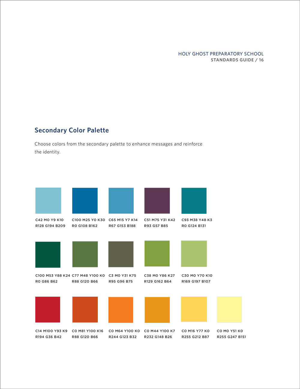
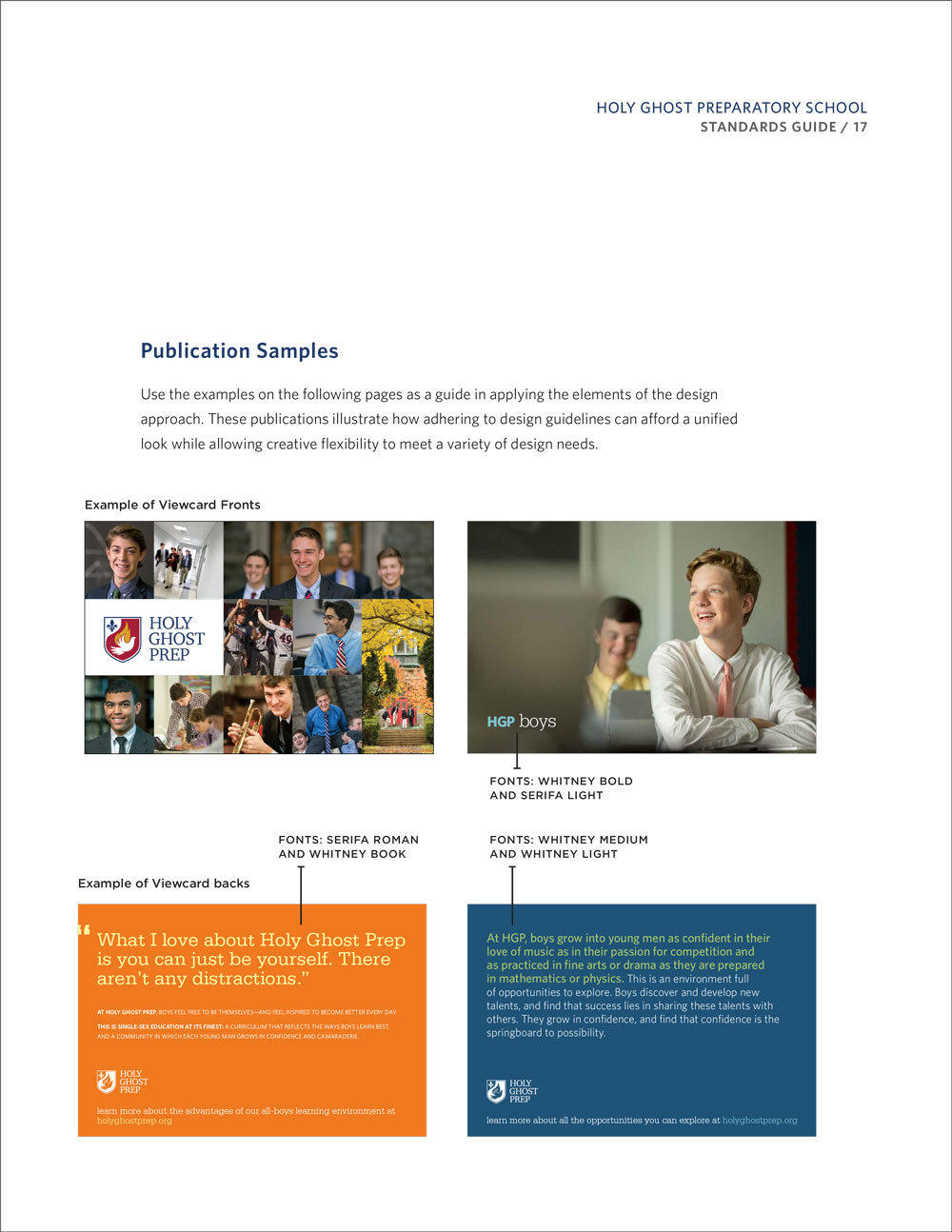
The logo, however, was just the start of a complete visual branding program, documented in a crystal-clear user’s guide. That guide specifies a color palette and set of fonts to use across all print and digital communications. It prescribes permissible uses of the school seal. And it provides detailed guidelines on applications ranging from letterhead to typical publications. (Note: if your current graphic standards manual focuses mainly on how big you can run your logo, there’s a lot missing.)

The HGP guide also presents a brand-new athletics identity, built around a spirited “firebird” logo that Kelsh Wilson developed. The mark is bolder and cleaner than any of the dozens of competing versions used in the past. And it’s a way to make use of a branding opportunity many schools miss—ensuring that every time one of your teams takes to the field, they are projecting the same image.

We would love to talk with you about how the kind of approach that’s working for Holy Ghost Prep could help your institution. Just email us to set up a call!

Communicating About Community / Canterbury School

melinda wissmann

kelsh-wilson-canterbury-email.jpg

In a new messaging program for the Canterbury School in Connecticut, Kelsh Wilson came to terms with a problematic fact: The word “community”—one of the most common in the viewbook lexicon— has not only been drained of its impact from overuse but, ironically, never meant that much to students to begin with.

When you speak to educators, parents, and alumni who are passionate about a college or school, one of the top reasons they cite is its sense of community. The particular institutional personality may vary from place to place, but the story of personal connections, shared purpose, and a feeling of belonging remain essentially the same.

What’s more, in focus groups with students, you find they agree—but with a catch: They rarely use the word “community.” They may speak about friendships or fitting in and feeling at home. They may say the best thing about the place is the people. But they don’t turn to abstract nouns, especially when they are seventh- or eighth-graders (a vital audience for any prep school). In other words, these students tend not to think in the same language as most administrators—and many marketers.

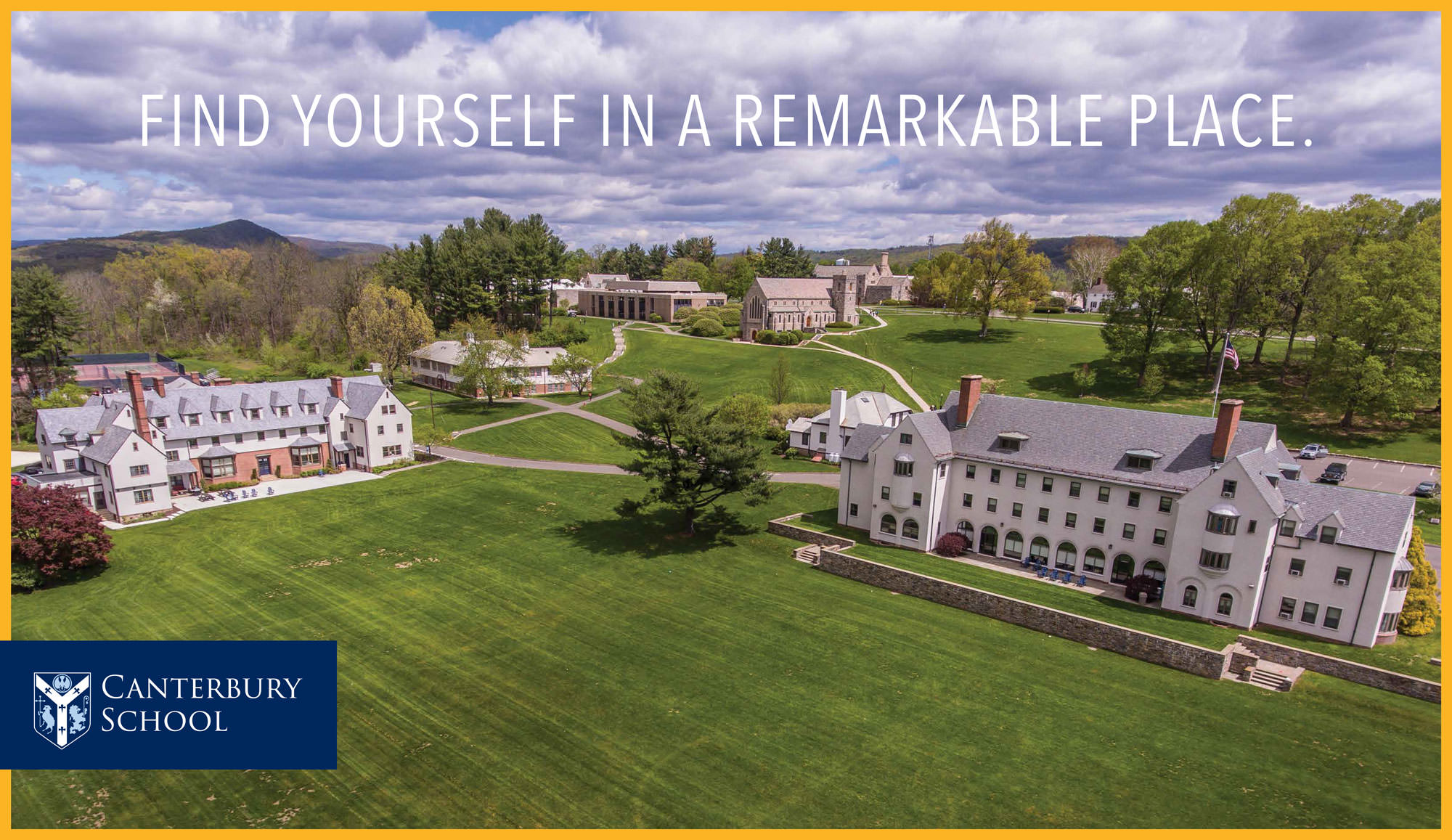
In a new communications program for the Canterbury School, a Catholic boarding school in New Milford, CT, Kelsh Wilson found that the message of community was absolutely central to the story the school needed to tell, and took on the challenge of driving it home with fresh impact.

One part of the answer was to unpack the term “community” and explore its many dimensions at Canterbury—from the idea of shared values and an education delivered on a personal scale to an open-minded, open-hearted campus spirit, welcoming to newcomers.

Another part of the answer was to invent a form of story-telling specifically to illustrate these ideas. In carefully planned words and photos, Kelsh Wilson’s new viewbook features Canterbury people in groups of two and three, speaking about their connections with each other. For instance, one section entitled “Form Powerful Partnerships”—presents Chris Roberts (teacher and coach) and Julia Dellaruso (student and player), with their comments on the varied ways they’ve worked together. The story-telling comes mainly in bite-sized quotes presented in a diagrammatic style over bold photos.

Pages-from-Canterbury_Mech_V26-4.jpg

Of course, the viewbook and the communications program as a whole develop other messages too, from the richness of the academic program to a commitment to service grounded in the school’s Catholic identity. But the signature creative element in the program—the profile stories—focus in on the signature strength Canterbury needed most to stress.

Like other school-wide messaging projects that Kelsh Wilson has undertaken, the Canterbury project started with a process of message building and testing, in which a number of key themes expressed in different ways were shared with target audience members for reaction. In addition to admissions print materials and new ads, the project includes a Brand Guide, to help bring consistency to a range of other ongoing communications efforts.

Pages-from-Canterbury_Mech_V26.jpg
Pages-from-Canterbury_Mech_V26-2.jpg
Pages-from-Canterbury_Mech_V26-3.jpg
Pages-from-Canterbury_Mech_V26-5.jpg
Canterbury-1184.jpg
CanterburyDrone_-622.jpg
CanterburyDrone_-679.jpg
Pages-from-Canterbury_Search_V19.jpg

The School Magazine Reimagined / The Independence School

melinda wissmann

In this age of digital media, one of a school’s most potent forms of outreach is actually one of the most traditional—the school magazine. The magazine offers the rare chance to reach all your institution’s audiences with a single compelling publication. It allows for multipage feature stories—virtually the only option left to explore important ideas in depth. And, in a strategic messaging program, it can play a key part—helping weave your message into your community’s sense of itself over time.

Think about it. Your brand strategy starts when you identify the way you want to position your school and the messages you want to send. But can you simply repeat those points again and again? No. You have to keep re-illustrating your strengths with fresh and interesting stories—and that’s the heart of a great magazine.

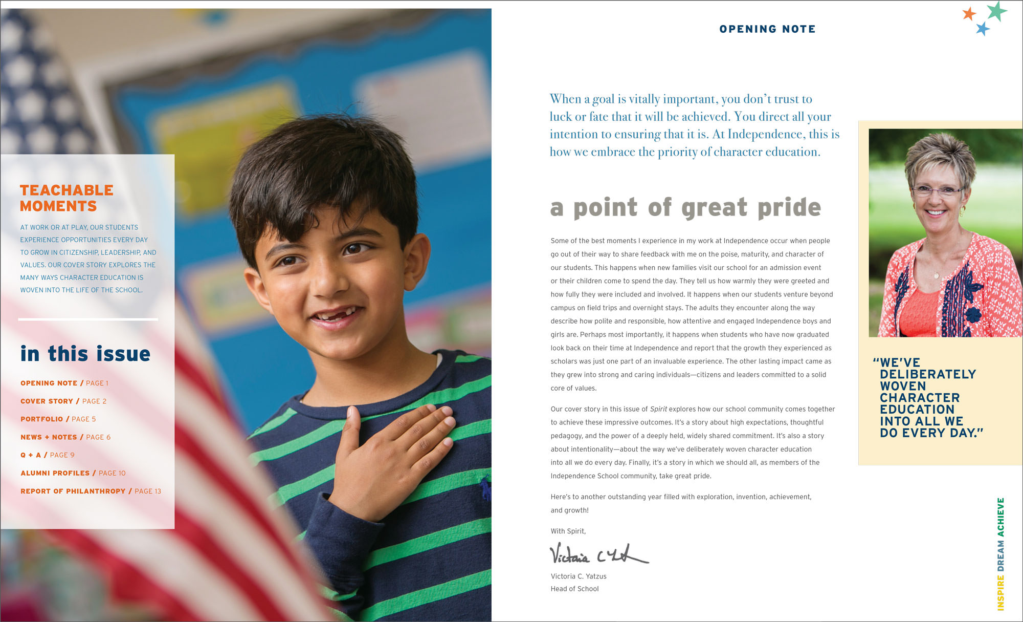
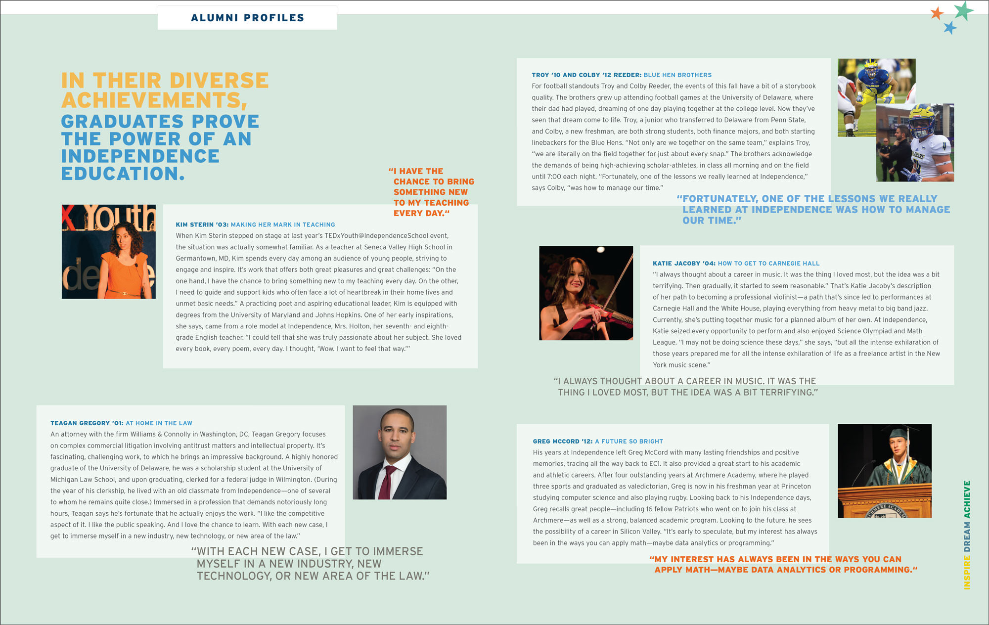
Kelsh Wilson has worked with institutions as diverse as The Masters School in Dobbs Ferry, NY, and the School of Engineering and Applied Sciences at the University of Pennsylvania to help bring new impact to their magazines. Most recently, we teamed up with The Independence School, a pre-K through grade 8 school in Newark, Delaware, to reinvent their semi-annual publication, Spirit.

Part of the project was to restructure the piece with the right departments—from “Portfolio,” showing off student work, to alumni profiles (formerly rambling and appearing on an ad-hoc basis, now short, sweet, varied and in every issue).

Another aspect of the challenge was to impose a new level of discipline on copy counts, making most stories shorter and the magazine as a whole more accessible.

And part of the challenge was also to update the look of the publication, aligning it with the KWD-developed visual branding that unites the rest of the school’s communications and projecting a new level of quality through the design.

The most important step forward in the evolution of Spirit, however, was in planning the content of major and supporting feature stories in order to align with the pillars of the Independence brand. In the first edition of the new Spirit, this meant diving deeper into the student experience and the minds of teachers with a feature on character education, a signature strength of the school. In future issues, features will rotate, with careful intention, through other key themes—always linking core messages with anecdotes from the life of the school right now.

The result of the Spirit redesign is a lively and colorful publication that’s generating lots of buzz—helping turn the school’s branding initiative into a sustained conversation. 

Drone Photos With a Professional Touch / The Knox School

melinda wissmann

In a new viewbook and search piece, Kelsh Wilson helped the Knox School show off its stunning waterfront campus in St. James, NY, as it never had before, in part, with the help of a drone.

One of the most important goals of a school’s admissions marketing program is to inspire families to visit, and one of the best ways of doing so is through photographs that tantalize with a preview of the sights that a visit will offer.

Unfortunately, practical challenges often get in the way: power lines obscuring the façade of your beautiful main building, or the simple fact that there is no place to stand to frame a shot that equals the impressive sense you get in person.

Over the years, Kelsh Wilson’s photographers have made a habit of solving these problems, delivering pictures no one has before. In the case of the Knox School, the solution was the smart use of a drone.

Knox sits on a lovely stretch Long Island’s North Shore. Its crew teams launch directly from campus, and every day, its students take in a range of gorgeous sites—the waters of Stony Brook Harbor, the historic mansion fronting the shore, the paddocks where the school’s resident horses graze. To get shots that showed these assets to full advantage, for instance, looking over the beautiful Georgian mansion to the waters of the harbor in a single shot, Kelsh Wilson took to the air with a drone—a professionally operated drone with a professional quality camera on board.

The results are a viewbook and search piece that show off the Knox campus as never before—and a series of photos that can be used again and again online, in print, and in table top displays at school fairs.

Villa Joseph Marie

melinda wissmann

Like so many excellent small schools, Villa Joseph Marie has traditionally done a better job fulfilling its mission of education than it has in the task of self-promotion (a less inspiring, but necessary endeavor). However, that recently changed when Villa’s admissions and marketing team decided to take the school’s communications program to a whole new level.

As a partner in this effort, Kelsh Wilson developed a set of powerful admissions publications for the school and also a User’s Guide to the Villa Message—a key tool in bringing consistency and impact to other communications, be they print, digital, or face-to-face.

The school’s president, Tom Kardish—who brings years of business experience and a Wharton MBA to the job—shares his thoughts on the project’s success:


I have two things to say about Kelsh Wilson:

1. They took the time, did the research and really “got” our school and our points of difference. More than the words, the look and feel match the incredible environment here exactly!

2. The hiring of Kelsh Wilson was a big step for Villa. It was a conscious decision to no longer be “the best kept secret” and break from our quiet humility. I am truly excited to see the long-term impact of this investment on our school and our community.

Our communications across all parts of our organization are clean, crisp, consistent and complementary. And most of all, honest. Villa is enjoying record enrollment, and it feels like the school could grow another 10 percent with the arrival of the class of 2021.
— Tom Kardish, President, Villa Joseph Marie