The Strategy of Synergy / Whittier College
melinda wissmann
Working with Whittier College in Southern California, Kelsh Wilson showed the power of leveraging your investment in admissions communications to create projects of other kinds that draw on the same look and drive home the same themes.
In the world of marketing, it can sometimes be tough for small schools to compete with larger ones, especially when the bigger institutions have proportionally larger budgets. Small schools do have at least one advantage, however: It is far easier for them to coordinate their many forms of outreach to project a single, consistent image.
Having worked with liberal arts colleges and independent schools on the one hand and flagship research universities on the other, this is a lesson the Kelsh Wilson team has learned firsthand. It is also an insight we recently put to work in a developing a series of projects for Whittier College in California, an excellent liberal arts school with just over 1,600 students.
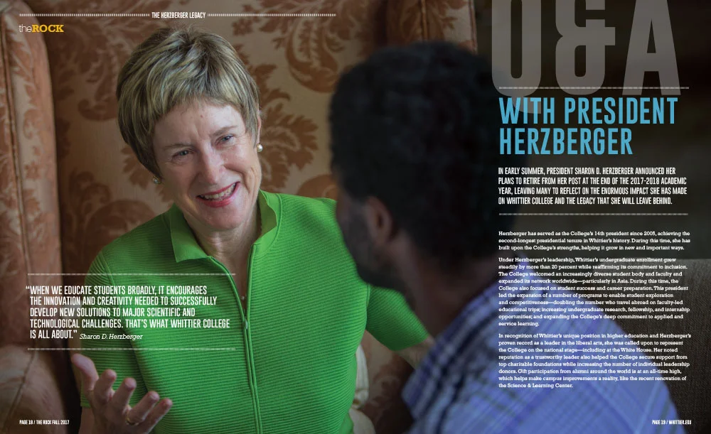
The College’s first priority was to create a series of new admission publications— very brief, solidly on message, and in-synch with Whittier’s newly redesigned website. However, Whittier’s wish list included other items as well, from a re-design of the College magazine, The Rock, to banners to brighten campus walkways. They also requested creation of a series of templates to be used for print and email communications produced by units across campus, from the president’s office to the registrar, to alumni and development.
Kelsh Wilson’s approach started by focusing on design and messaging for the re-invented admissions materials, brief, bold, and light in tone, but driving home compelling content points, whether about the distinctive strengths of liberal arts learning or the career success of recent grads.
KWD’s designers then took key elements from the admission pieces—from typefaces and dominant colors to aspects of layout—and applied them in developing flexible templates for a multitude of other print and digital uses, from emails and invitations to short brochures. They also applied these elements in the design of banners that will define the boundaries of campus and festoon the paths followed by families on admissions tours.
In redesigning The Rock, Whittier’s magazine, the team extended the look further and took greater liberties, creating a solution suited to the unique content demands of a periodical. Still, it’s easy to recognize the magazine as an expression of the same institution behind the rest of the communications program.
The synergistic approach Whittier and Kelsh Wilson followed offers two important advantages. First, for any institution whose success depends primarily on tuition revenue, it’s smart to use every investment in marketing and communication to reinforce the impression created by the school’s admission outreach. Second, by making the admission materials the pragmatic starting point for other important projects, the client can realize major savings—working with one firm rather than several and investing in a single major design exploration (albeit with variations), rather than many.


