Speaking Visually / Holy Ghost Prep
melinda wissmann
Working with Holy Ghost Prep, an independent boys school outside Philadelphia, Kelsh Wilson helped create a visual branding program to ensure that every piece the school creates contributes to an instantly recognizable look—a major step to a powerful brand.
It’s such a basic point that it may sometimes be overlooked: A brand is nothing without consistency. You need to repeat the same set of messages if they are going to sink in. You need to employ a single set of visual elements to create a look that people will recognize.
Doing so is key to building public recognition for your school. It also communicates a strong message that you are running a professional, coordinated operation. Last but not least, consistency is absolutely essential if you are working with the kind of limited marketing budget most schools have; the tighter the money, the more important that every brochure, email blast, and ad buy pulls in the same direction.
The question, of course, is how? Your marketing team dreams of consistency, yet when you collect your year’s work on a table, it’s not a pretty picture.
The answer is that you need a set of tools that together create a visual system, and you need to employ those tools systematically. As Kelsh Wilson and Holy Ghost Prep have together proved, it’s not something that happens without effort, but it’s more than possible with the right approach.
Kelsh Wilson’s work for Holy Ghost started with the design of a new school logo—deeply rooted in HGP’s oldest traditions and symbols, but rendered with a whole new level of clarity. (The dove, flame, and fleur-di-lis that form the mark represent the Holy Spirit and the French roots of the school’s founders, the Spiritan Fathers.)
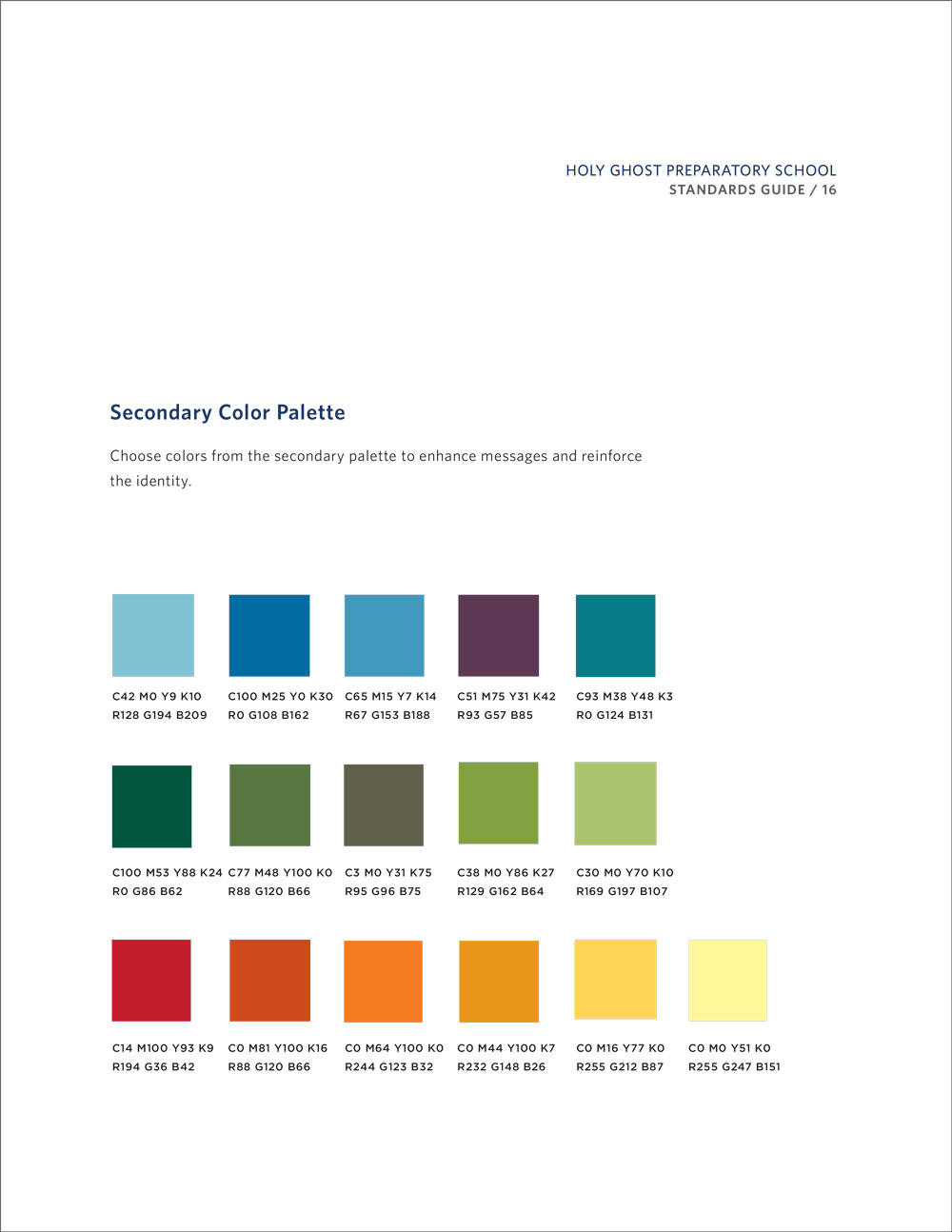
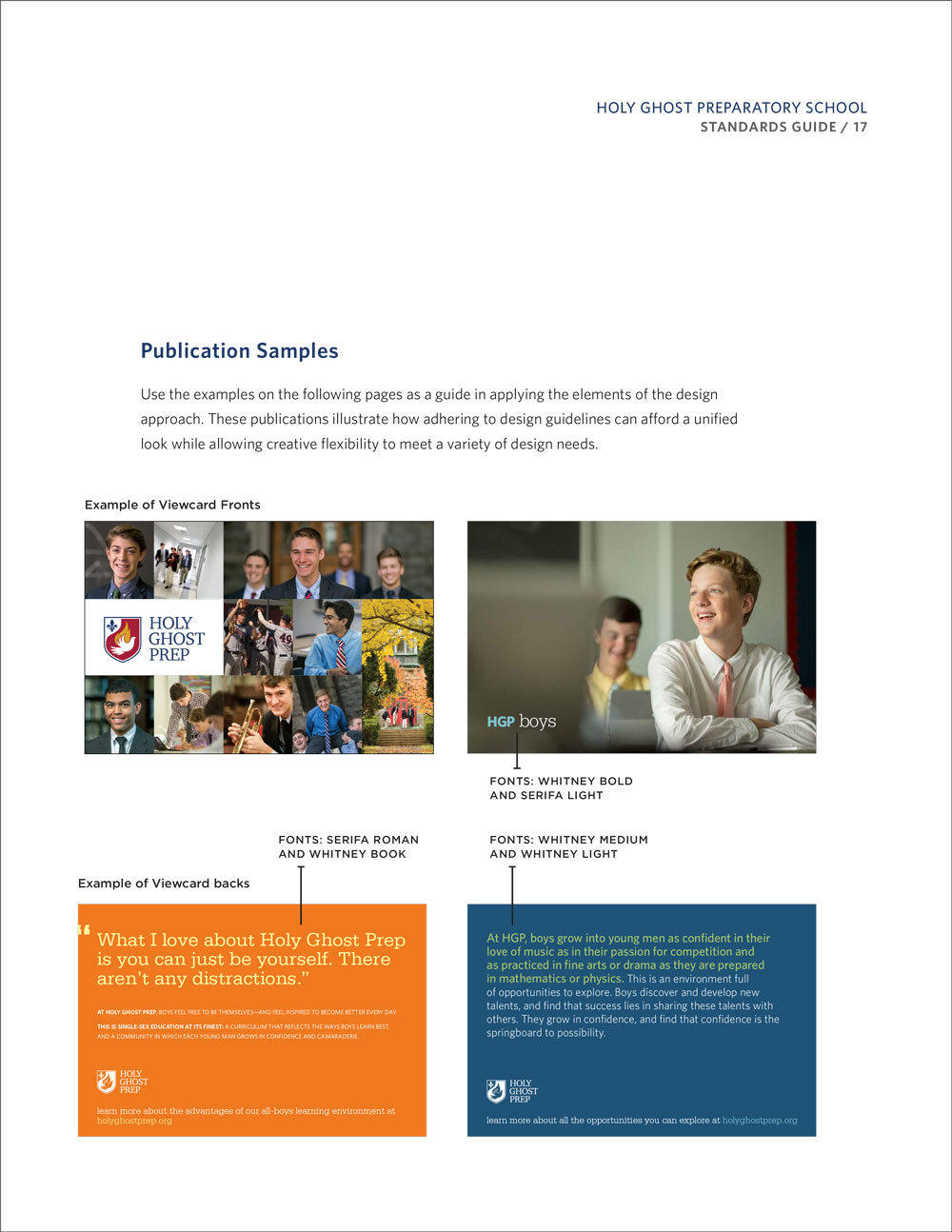
The logo, however, was just the start of a complete visual branding program, documented in a crystal-clear user’s guide. That guide specifies a color palette and set of fonts to use across all print and digital communications. It prescribes permissible uses of the school seal. And it provides detailed guidelines on applications ranging from letterhead to typical publications. (Note: if your current graphic standards manual focuses mainly on how big you can run your logo, there’s a lot missing.)
The HGP guide also presents a brand-new athletics identity, built around a spirited “firebird” logo that Kelsh Wilson developed. The mark is bolder and cleaner than any of the dozens of competing versions used in the past. And it’s a way to make use of a branding opportunity many schools miss—ensuring that every time one of your teams takes to the field, they are projecting the same image.
We would love to talk with you about how the kind of approach that’s working for Holy Ghost Prep could help your institution. Just email us to set up a call!


